Custom WordPress Design: Moving On
This page may contain links to Amazon.com or other sites from which I may receive commission on purchases you make after clicking on such links. Read my full Disclosure Policy

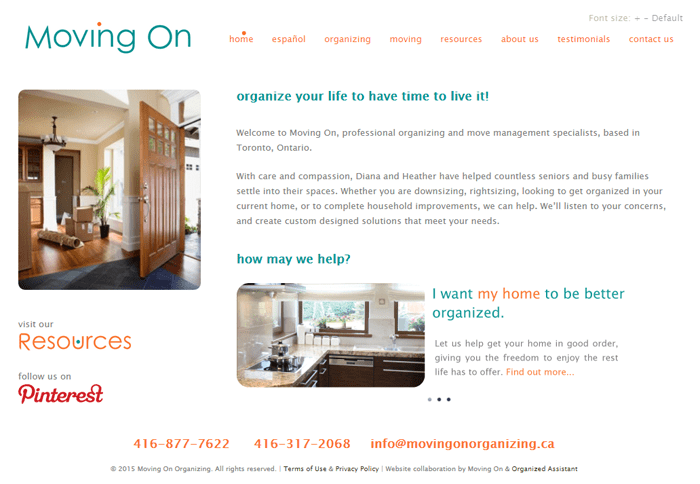
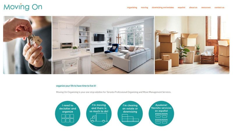
When asked for samples of my custom WordPress design projects, I’m always proud to show off the site I created for Moving On Organizing, even though it was a number of years ago. It was one of the most exciting projects I’ve ever worked on!
Co-owner Heather Shute tapped into her background in interior design to present me with a vision, and I applied my technical skills and resourcefulness to bring that vision to life. Special features include:
- a tool that allows the user to increase and decrease the font size as needed (to accommodate seniors accessing the site)
- rounded corners on the images
- a dot that moves with the mouse pointer over the main menu
Rather than a traditional blog, Heather and Diana chose to have a Resources section featuring their favorite businesses (including mine!). Here’s what they said about me:
“Working with Janet Barclay was a dream. Her prior life as an organizer certainly made itself felt. Janet is as adept, detail oriented, timely and courteous in her web development as Moving On is with our organizing and project management. She has taught us about WordPress as we’ve gone along so we can manage on our own (most of the time!) Janet, we could not have accomplished this beautiful website without you!”
Heather Shute & Diane Vela
If a new website is in your future, get started on the right foot by reading my blog series, Planning a Website the Organized Way.


Your theme looks great – simple and clear! So, you can keep going show off this site.
Thanks, Adam – I appreciate that!
I love being able to look back at a “job well done.” After all, we got into business to make a positive impact, so it means so much to have satisfied clients and tangible results. A beautiful website indeed!
It’s also helpful, when we run into a particularly challenging situation, to look back and say, “I did THAT; I can certainly do THIS!” Thanks very much for your comment.
I love that the site has a unique look. I love it. I can see why you use it as a sample. Great job and testimonial too. =) You should share your samples on social media more often. I would love to see more of your work.
Thank you, Sabrina! All four of the “Related Posts” at the end of this post feature other websites I’ve created, if you’d like to check them out.
I certainly enjoyed working with you on my new website a few years ago! Here’s the story you wrote about that: https://yourorganizingbusiness.com/another-professional-organizer-chooses-wordpress-for-her-website/
Thanks, Hazel! I enjoyed working on your site too.
What a beautiful, clean, crisp site! That was my goal with my website makeover 2 years ago. Surprisingly not all organizers follow that concept. Job well done!
It is surprising, isn’t it? “Clean and uncluttered” is what all my clients are looking for these days, even those who aren’t organizers!
I love the rounded corners on the pictures. What a great site!
Thank you, Jamie. I loved partnering with someone who has a design background!
Looking forward to working with you on my new site. Seeing this beautiful site gets me inspired.
Make sure you write down all your ideas! I recommend working through my Planning a Website the Organized Way series, if you’re not already.
What a beautiful website you designed and such a sweet testimonial. A great pairing between an interior designer and an organizer! And I like those rounded corners too. Kudos!
Thank you, Sarah!
Hi Janet!
In any project that we undertake, having the right “team” of people to help us bring the vision to fruition is essential. How wonderful to know that you’ve been and continue to be a great partner on that team for so many. It must feel good to reflect back on successful projects and happy clients like Moving On and Hazel.
You know all about that, don’ t you, Linda? You outlined the process very nicely in your guest post, Book Dream to Right Team. Very satisfying indeed. 🙂
Great cleanly designed site! I love the look of the teal and orange font on the white background. It really helps to spread the brand’s colors throughout the site.
Thanks, Nancy! I love that it’s not a really common color combination too.
Choosing the right design, the layout of your website is SOOO important! That’s what make the first impression of you and your business.