A website update for today’s demanding market
This page may contain links to Amazon.com or other sites from which I may receive commission on purchases you make after clicking on such links. Read my full Disclosure Policy
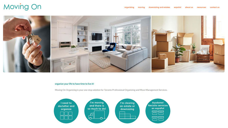
One of the most exciting websites I’ve ever worked on was the one I created for Heather and Diana at Moving On Organizing in 2011. It was a beautiful custom design that I was always proud to show off.
As I often say, a website is always a work in progress, so by last year, this once wonderful site had fallen behind the times. The major issues were:
- The site wasn’t responsive. If potential clients visited on a mobile device, they’d have trouble reading it and probably wouldn’t stick around long enough to find out how Moving On could help them. This factor can also hurt a site’s search engine ranking.
- Text and images were quite small and not in keeping with today’s trend of having everything big and bold.
It was definitely time for a website update!
Because I’d developed the original site, I knew its inner workings and was able to make the necessary design changes without the work and expense of starting from scratch with a new WordPress theme. This allowed us to retain many of the customizations from the original design, such as the dot that moves with the mouse pointer over the main menu.
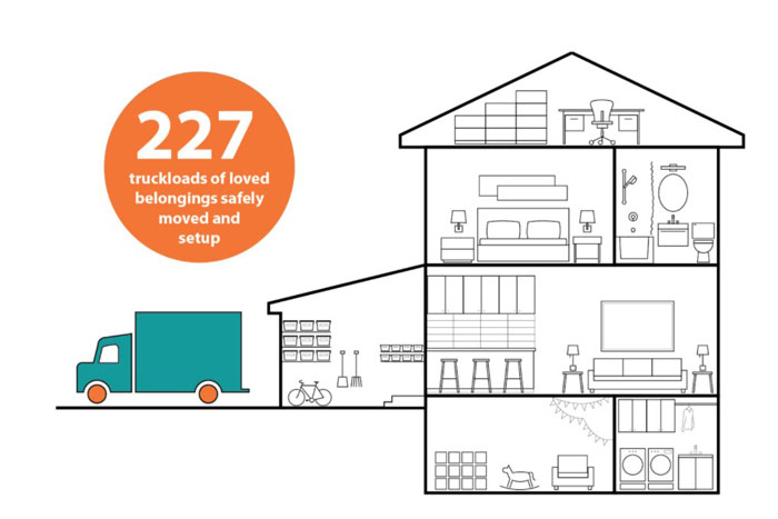
To take things up a notch, Heather put on her designer hat to create a unique interactive graphic for the home page. Click through to see it in action.
Pretty cool, eh?
Of course, a website isn’t all about looking good – it needs to function well too. While implementing the design changes, I also installed an SSL certificate to reassure visitors that their information is secure, and took steps to make the site load more quickly.
I’m very pleased with the outcome and, more importantly, so are my clients and their clients.
Could you benefit from a website update? Contact me – I’d love to help you bring your vision to life!

Yes, I’m definitely in the market for an update. I know it will require a lot of time and money on my part, but I would like to know what kind of investment range I should be anticipating. Can you email me directly on that?
I’ll be glad to, Seana.
I am waiting for the next COvid slowdown to make changes to my site. Corvid didn’t slow down for long enough the first time for me to get to this item. lol I worked on an online course the first time.
I am in the same boat but I don’t think we’re supposed to complain about that!
I love that interactive graphic! It’s very clever and gives the viewer a confidence level in the company’s capabilities and experience. I’m a huge believer in having an updated website. At the beginning of 2020 (pre-pandemic days), I consolidated my two websites into one newly designed one. It’s the third time in 27 years that I did a major website overhaul and redesign. One of the hard parts was adjusting to the new Squarespace platforms. The backend functioned differently than my previous sites. So there was a learning curve. But that was OK. It was a good challenge, and now it feels seamless to add blog posts or update information. The other advantage of updating, aside from the technology issues, is it gives you a chance as a business owner to take a fresh look at what you do, how you do it, and who your audience is.
That’s a very good point, Linda. People often come to me looking for a new design but they want to keep the exact same content and page structure, and I have to explain that a new design won’t bring them more business if the old content doesn’t clearly articulate their unique value proposition.
I love the interactive graphic on the website! I recently redid my websites a few years ago and felt that it really did help bring a fresh focus and understanding to the visitors that would come to the sites. Your service is precious. Every business owner should not leave their website plain and boring. No one will visit it. There needs to be something that sparks their mind to remember a site.
And to remember it in a good way – not as that site with the crazy animations or the funky color scheme! LOL