How to improve your Facebook ads using the right typography
This page may contain links to Amazon.com or other sites from which I may receive commission on purchases you make after clicking on such links. Read my full Disclosure Policy
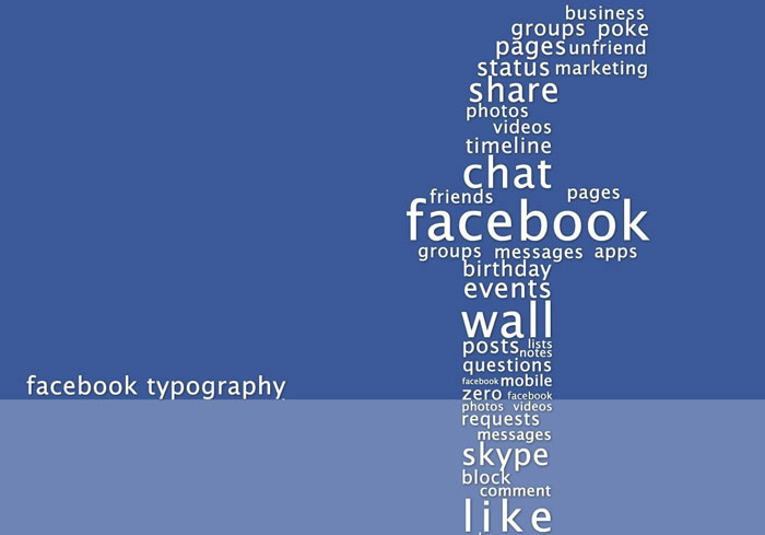
Social media has radically changed the way we do business, and in many ways, it has been in favor of small businesses. Back in the day, even the most tech-savvy business owners had a tough job getting one over big businesses because they have the resources to pull all the stops in making their online business presence felt. Today, a single Facebook ad could propel your business to viral heaven and get people talking about you and your products.
Ecommerce entrepreneurs cannot afford to ignore the power of social media. It enables you to gather feedback from your audience instantly. It may be wise to listen to opinions and suggestions of prospective clients as they may offer better insights and perspectives that may be helpful and beneficial to your campaign/business. Chances are, you are a Facebook user yourself, making you understand why this particular platform is a great business tool. Facebook ads can make a bucket load of money for you, provided you do it creatively and interestingly.
It is easy to set up a Facebook page and to learn the ins and outs of Facebook advertising for online businesses. However, what many people fail to give due attention to, is the design of the ad itself. An ad for a fantastic deal for one of your products may not be attractive enough to catch anyone’s attention because of its physical look. In many cases, something as simple, but essential as the typography can make or break your campaign. You can use typography rules for this, but many factors will affect your choice. Here is how to improve your Facebook ads using the right typography.
Check out your target audience
Typography is one of the most important and gratifying components of graphic design, and like any design, there is a psychology behind it. Some designs might appeal to some people and not to others. Before you decide on which typography to use, you need to have a target audience for a particular Facebook ad campaign.
This is not necessarily the demographics of your audience, although this could be a benchmark. Check Facebook Insights to see if the buyer’s persona in mind for a Facebook ad campaign, is actually a match to the people who are “liking” or following your page. If it isn’t, then you might want to tweak your ad a bit.
For example, if you are targeting 13 to 17 year old females, you need to choose ad typography that translates well to mobile devices. If you try to put in too much content, your tendency is to choose small fonts, and in a mobile device, they either become unreadable, or requires scrolling. They don’t like that. Instead of cramming content in your ad, choose a few powerful (read: emotional) words in bold or attractive fonts to compel them to pay attention, and a large clickable call to action, like a Buy button. It won’t matter whether they see your ad on a laptop, tablet, or smartphone.

Different strokes for different folks
In most cases, however, you won’t be targeting just a single segment of your possible audience. You may have a Facebook ad campaign that cuts across a broad spectrum of the population. You can still make the most of your money by using exclusions. Facebook allows you to customize your ad by creating a custom audience. What this means for each ad you send out, you can choose who sees it and who does not.
For example, if you have a special offer for just men, then you can exclude all members that identified themselves as anything but male. On the other hand, you may have a similar offer to just the females, in which case you can just tweak the offer and change your exclusion. For each of these segments, you will have to make changes to your design as well. You can use clean, bold typefaces for men, and saucy, playful typefaces for the women. That’s stereotyping, but it usually works.
Capitalize on value
Most people that respond to an advertisement do so because it addresses a need they have at that particular moment. For example, if you are about to get married, and you see an ad for a bridal fair in your city, then you will most likely register for it. In other instances, your audience responds because it promises entertainment or information. It could be a provocative statement or headline because it deals with a hot topic, or reveals something startling or unusual.
If you can hit any of those buttons for your target audience, your ad is most likely to be successful. However, aside from your actual content, the way you present it is crucial. You have about a second to get their attention before they scroll to the next item on their newsfeed or timeline, so you have to say it straight at the very start. Check this out:
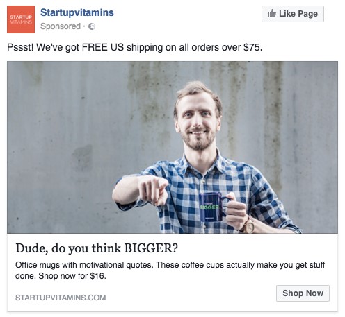
The ad is not all that sophisticated, but you know exactly what it is all about. Do you notice how the “FREE US” and “BIGGER” was capitalized? Your target audience (i.e. a 30-something coffee-drinker with some self-esteem issues) will see both of these powerful messages in a flash, and will either decide to know more about it and click on “Shop Now” or move on. In either case, you succeeded in engaging your target audience by simply using capitalization in the RIGHT places.
Conclusion
Many factors can affect the success of your Facebook ad. Typography is just one element of design when all is said and done. However, it is often overlooked that very few people really consider how it may affect engagement at any given time. If you do A/B testing for your ad campaign, you may be surprised at how little tweaks in typography can change overall engagement.



I didn’t know that typography is so important when it comes to Facebook adds. Thanks for opening my eyes! Great article
Yes! in this post is very interesting and useful information. I will definitely try some of the tips that are stated.
Yes, it really works, Gareth!
You’re welcome, Amy!